Colours, Submarks, and Patterns
In this series, I will go over the whole process of designing my visual identity. It's quite long so I've divided it into 5 parts:
- Part 1: Logo Design Process
- Part 2: Logo Design Process cont.
- Part 3: Colours, Submarks, and Patterns
- Part 4: Stationery Design
- Part 5: Stationery Design cont.
The Colour Palette
I actually decided on my colours long before I designed my logo. I found a colour palette that I loved many years ago (can't seem to find the exact one anymore - I'll update the post if I do) but never got to use it in any other project. The colours were more muted, though, so I used them more as a guide and ended up with these:
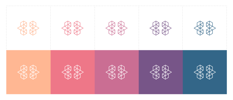
Five colours is probably a little overkill, but I couldn't help myself. I've always enjoyed working with colour so I thought it made sense to go for a colourful visual identity.
Submark Design

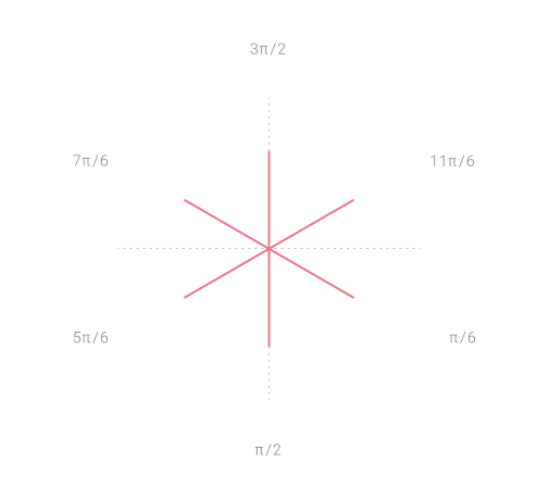
This was one of the logo concepts I shared in Part 1, made using the binary representation of the character 'Z'. Even though this came before the main logo, I've decided to use it as a submark. With the 48 line segments in the primary logo representing my name, it's like the submark was pulled from the logo. It will mainly be used in applications where the main logo won't work and needs to be collapsed into a smaller version.
![]()
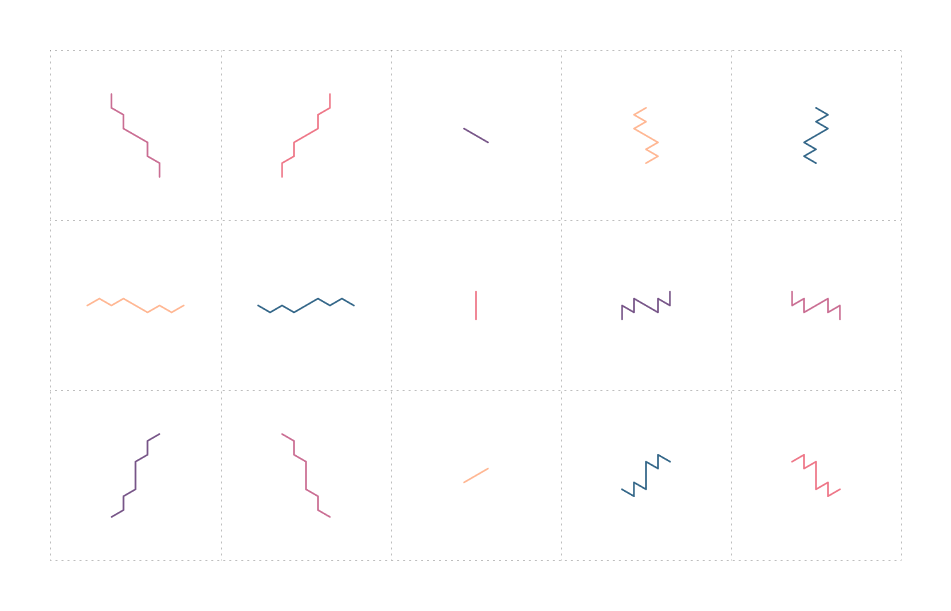
But rather than hard-coding the angles for the 1's and 0's (π/6 and 11π/6, respectively), I decided to turn it into a generative submark where the angles are randomly selected from an array that holds the 6 angles that make up the primary logo (measured clockwise):
This yields the following 30 submarks:
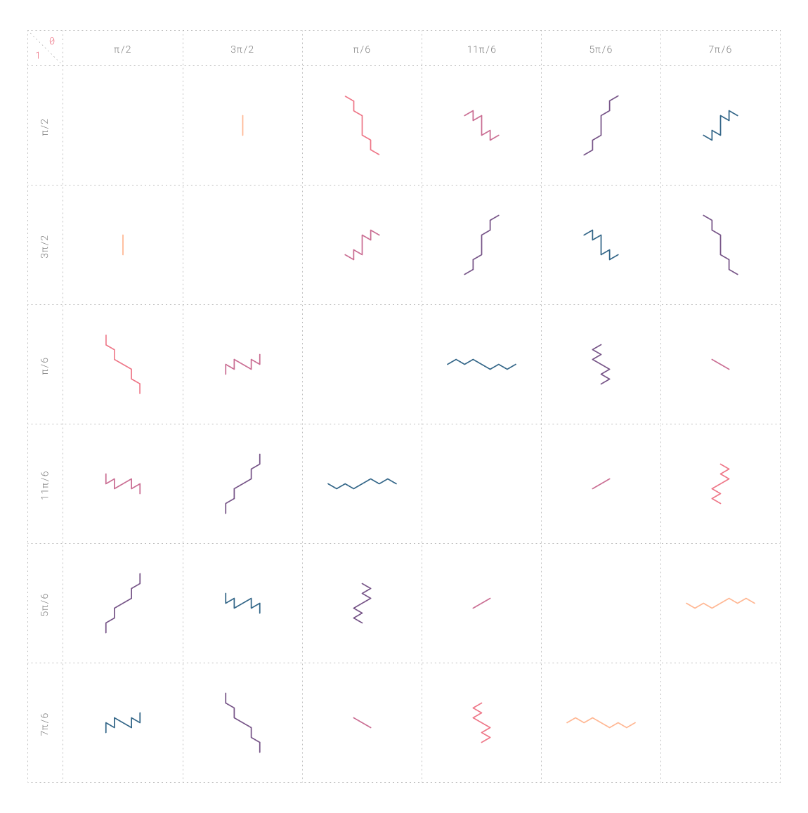
Submarks end up looking the same when both their 1's and 0's have opposite angles:
This leaves 15 unique submarks:
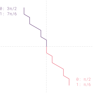
One thing I will be using them for is to sign off my posts (see below - press on it to generate a new one).
Pattern Design
I wasn't planning on designing patterns at first, this was just a happy accident. Without meaning to, I somehow managed to combine all of the generated submarks into one and this was the result:
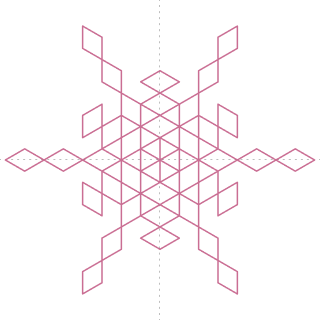
I thought it was perfect! Aligning the horizontal and vertical centres of the submarks produces this shape:
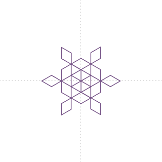
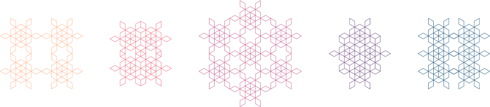
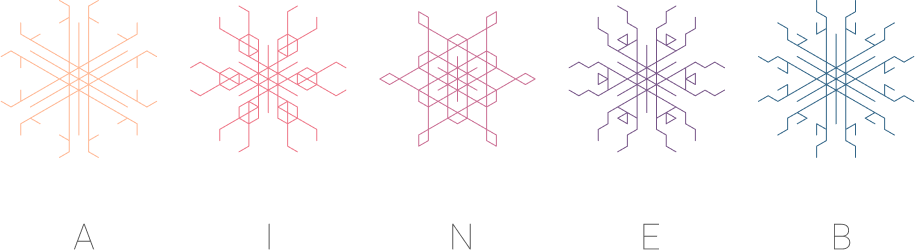
I was curious to see what sort of shapes the remaining characters in my name would produce:
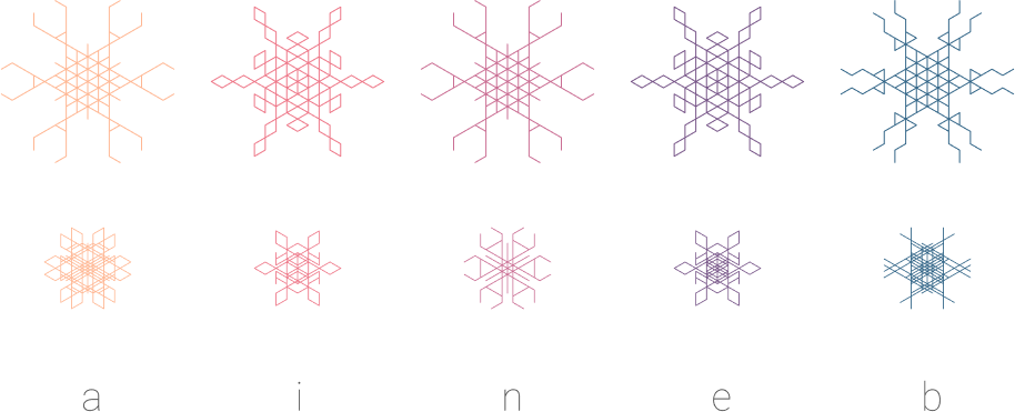
This opened up a whole new world of exploration. I'll share more in a future post, but for this particular project, I thought these shapes would be great for pattern design. However, since most of the lowercase characters shared the same shapes, I decided to use the uppercase versions for the final patterns for added variety as each one produced a unique shape:
I also used the same concept to generate the thumbnails for my posts, but this time I converted the post number to binary. Here are the first 10 (after aligning their horizontal and vertical centres):
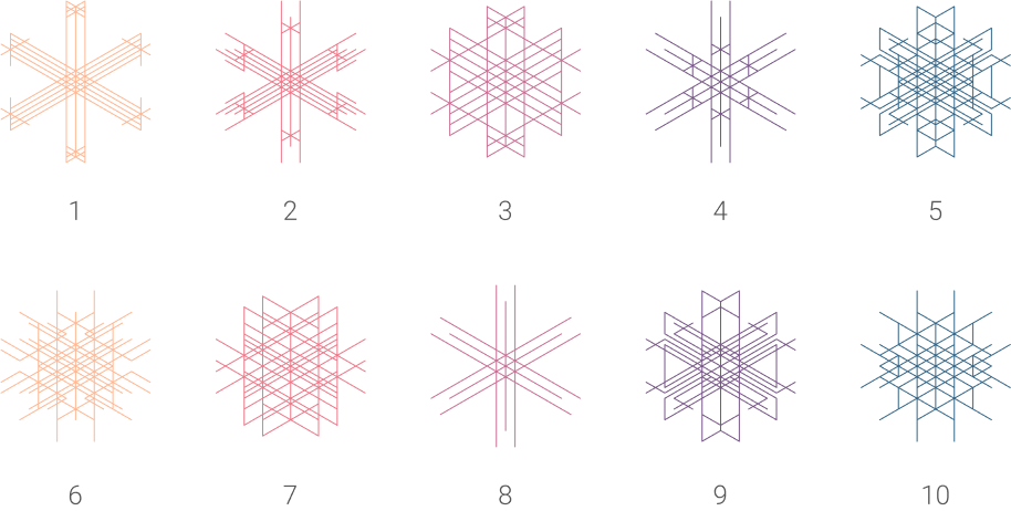
Again, I'll go into more detail in a separate post.
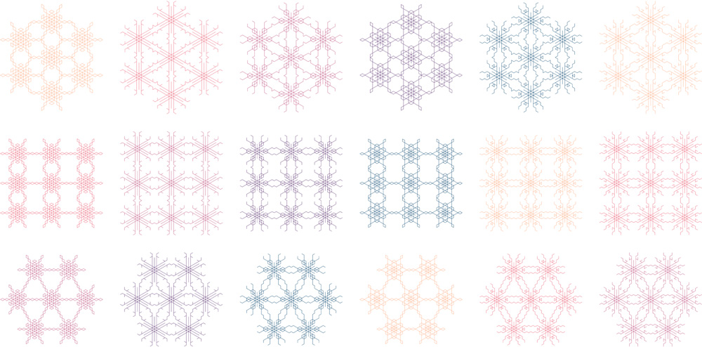
Here are the final patterns:
While this is probably not the most ideal way to go about designing a visual identity, I'm happy it worked out this way. It was a lot of fun, and there were plenty of surprises and happy accidents along the way. I'd do it again in a heartbeat!
Next up, stationery design!
Thank you for reading!
Zaineb