Stationery Design - Part 1
In this series, I will go over the whole process of designing my visual identity. It's quite long so I've divided it into 5 parts:
- Part 1: Logo Design Process
- Part 2: Logo Design Process cont.
- Part 3: Colours, Submarks, and Patterns
- Part 4: Stationery Design
- Part 5: Stationery Design cont.
I may have gone a little overboard designing my stationery but I'm so happy with how everything turned out.
This is going to be long (again), so I've divided it into two posts. I will share pictures of everything and talk a little about them, but first... here's what I made:
- Business cards
- Bookmarks
- Pencils
- Stickers
- Magnets
- Notepads
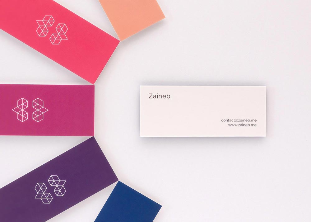
Business Cards
I decided to keep the business cards simple. When it comes to the look and feel, there's really nothing special to them... but what helps them stand out is their size and colours. They're always a conversation starter. It's also fun to let people pick their favourite colour (I removed some personal details from the front side here):
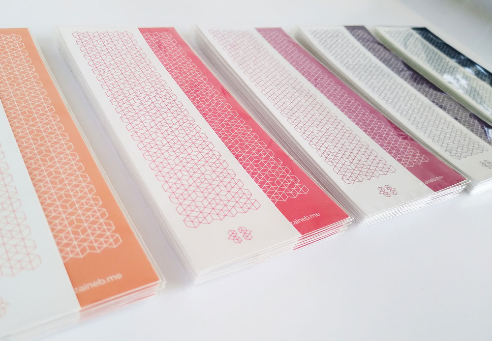
Bookmarks
I designed the pattern on these bookmarks long before I thought of the submarks, so now I wish I'd waited before printing them. I still like them, but for the next batch I'll be using the new patterns.
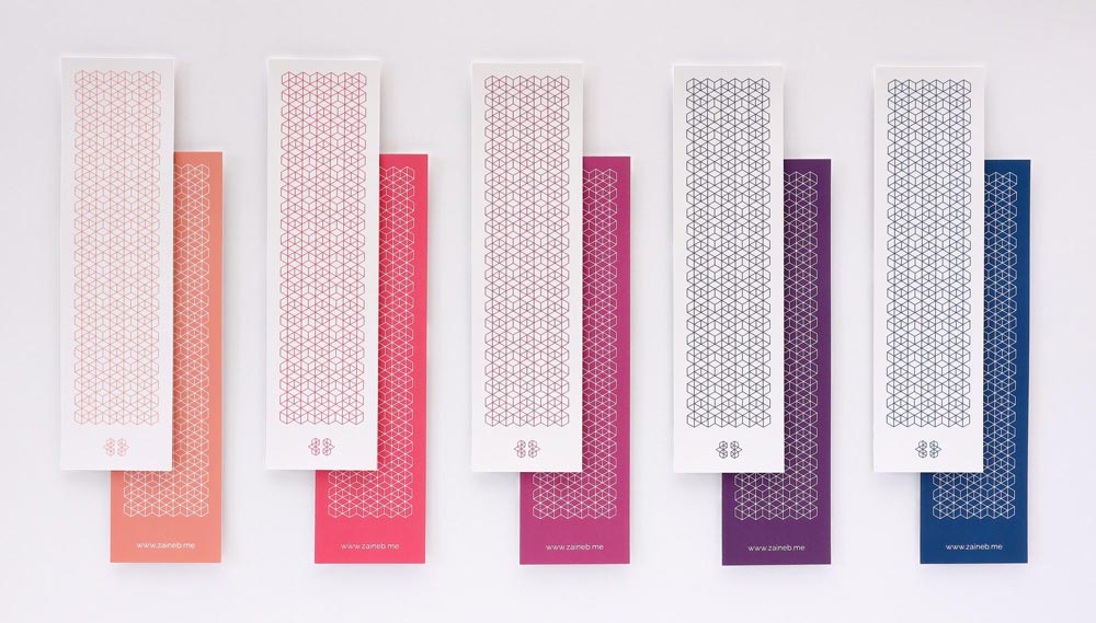
Here's how I packaged them:
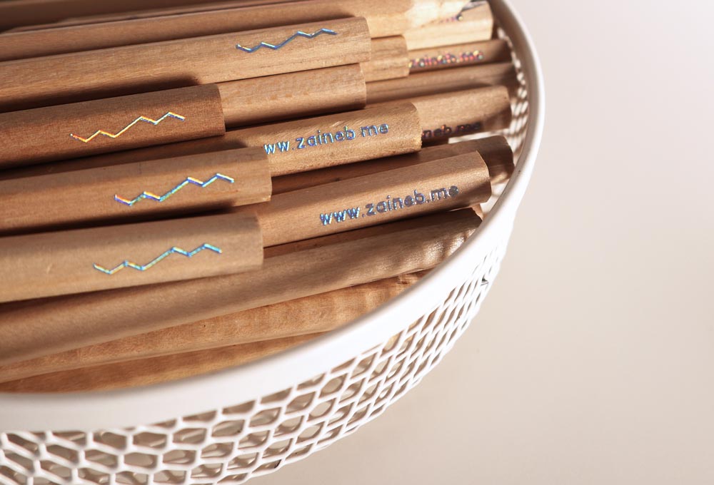
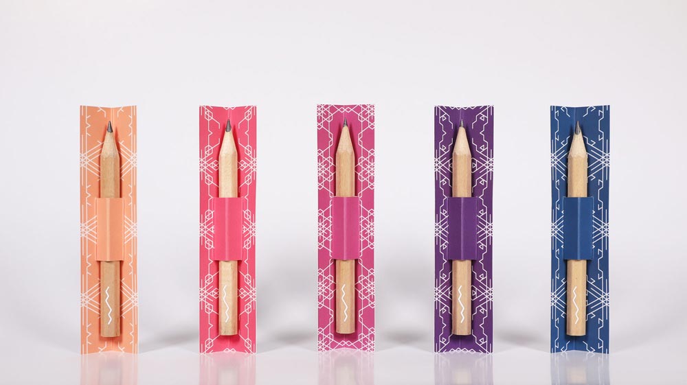
Pencils
These are probably my favourite. I foiled these pencils on my pen plotter (I have another series coming up all about the pen plotter). I went with the first submark as it was the perfect size, with my web address on the other side.
I'll be sharing more about these in a dedicated post, but here's a glimpse for now:
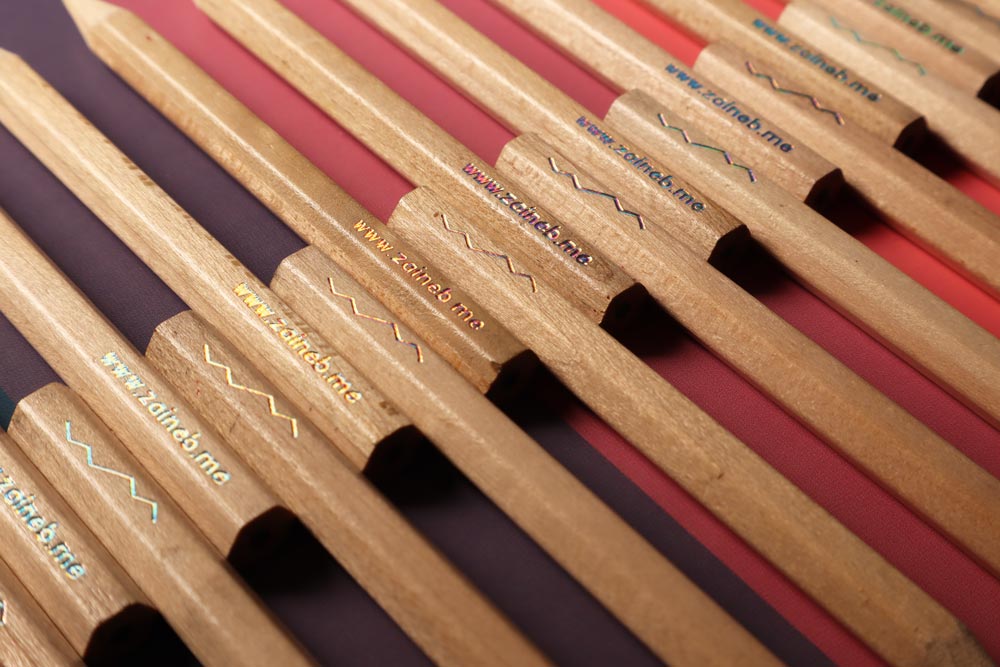
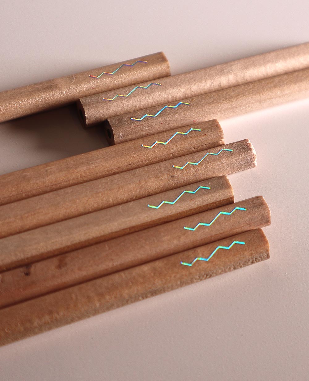
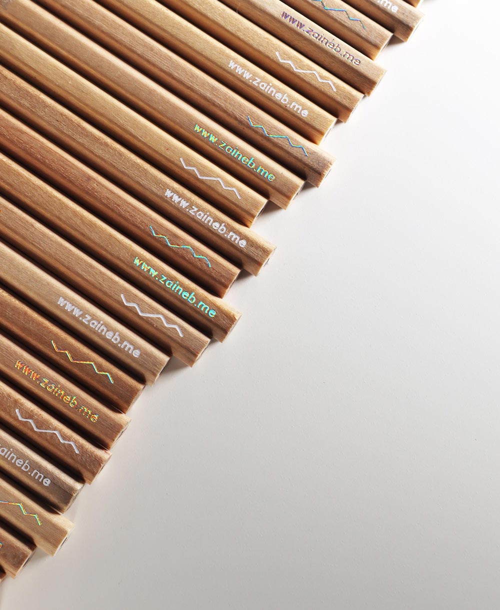
I tried 5 different colours: metallic gold, satin gold, silver, holographic, and white... but then narrowed it down to the holo and white foils as I felt they were more on brand than the others. Unfortunately, I couldn't find any foil in my exact colours.
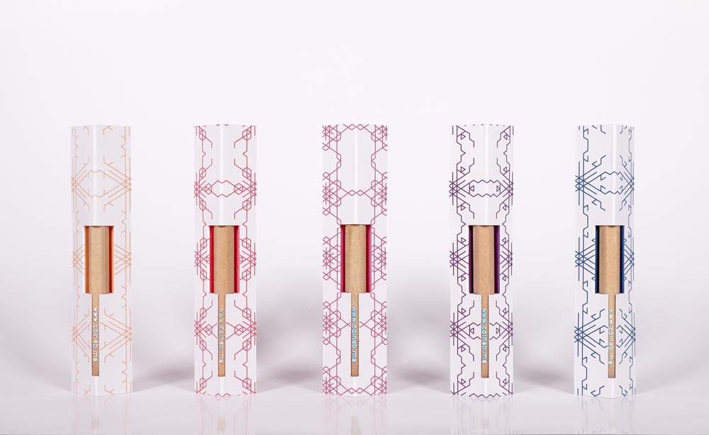
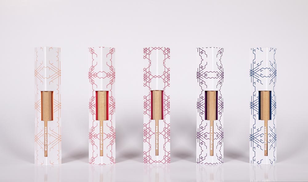
I used the new patterns to design the packaging for the pencils. Here's the front side:
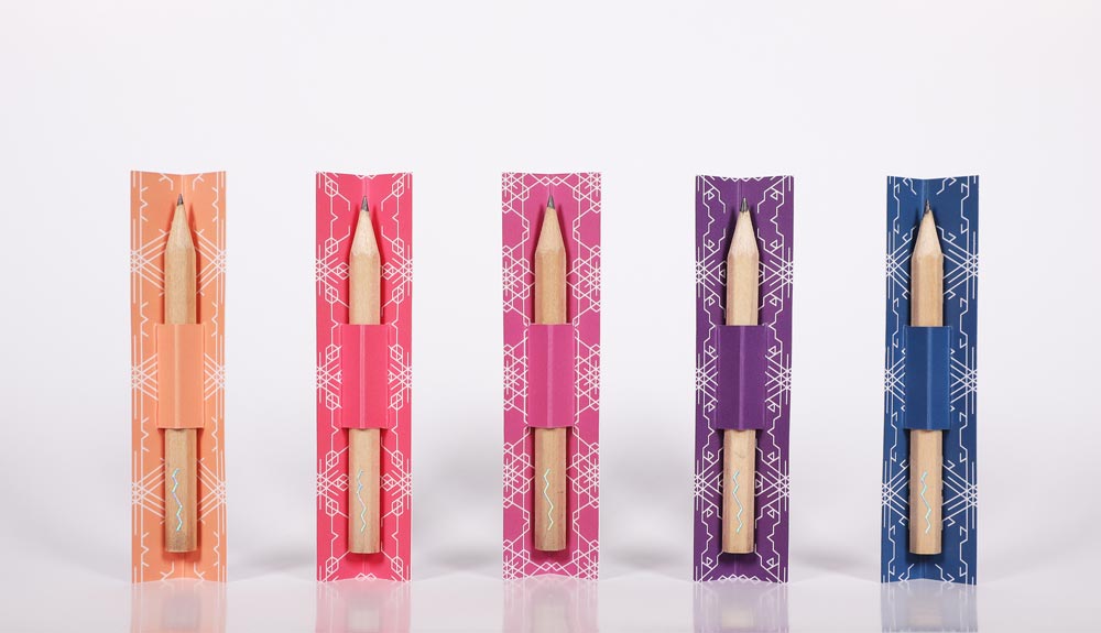
And the back:
In the next post, I'll go over the stickers, magnets, and notepads.
Thank you for reading!
Zaineb